To maintain the cohesion of the uOttawa brand, no alternate colours or other modifications are permitted.
Brand
A new visual era is here at uOttawa: discover Horizon, our refreshed visual brand identity. Designed for our external partners, this page features the essentials for your projects. University employees can visit Horizon in VirtuO to learn more.

Approved uOttawa logos
Vertical logo in black
Vertical logo in white on charcoal background
Vertical logo in white on garnet background
Horizontal logo in black
Horizontal logo in white on charcoal background
Horizontal logo in white on garnet
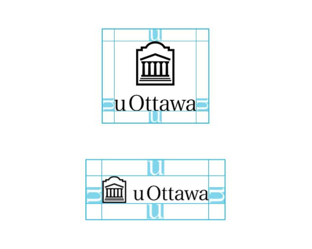
Logo safe area
In order to preserve the integrity of the uOttawa logo and brand, the safe area, or "u factor," must always be respected in print products, as shown below.
The "u factor" refers to the safe area around the University of Ottawa logo, which must never be encroached upon by other visual elements or text. It ensures that the logo is never placed too close to the edge of a document. The u factor is measured using the height of the lowercase u in the uOttawa logotype and must be applied to all four sides of the logo as illustrated above.
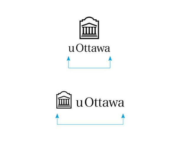
Logo minimum sizes
Vertical logo
Print: 0.75 in (1.91 cm)
Web: 72 px
Horizontal logo
Print: 1.25 in (3.175 cm)
Web: 150 px
Looking for official uOttawa logo files?
uOttawa faculty and staff
Logo downloads can be found on the internal virtuO site.
External community
Download will be available soon, until then please email the brand team.
Colours
Primary colours

RGB 143-0-26
HEX #8f001a
PMS 7427 C Custom
CMYK 9-100-73-35
HEX #8f001a
PMS 7427 C Custom
CMYK 9-100-73-35

RGB 45-45-44
HEX #2d2d2c
PMS Black C -93% tint
CMYK 32-31-35-80
HEX #2d2d2c
PMS Black C -93% tint
CMYK 32-31-35-80

RGB 128-116-108
HEX #80746c
Warm Gray 9 C Custom
CMYK 52-51-55-9
HEX #80746c
Warm Gray 9 C Custom
CMYK 52-51-55-9

RGB 99-109-119
HEX #636d77
PMS 431 CP)
CMYK 63-45-34-25
HEX #636d77
PMS 431 CP)
CMYK 63-45-34-25

RGB 103-121-108
HEX #67796c
PMS 4198 CP
CMYK 55-30-46-21
HEX #67796c
PMS 4198 CP
CMYK 55-30-46-21

RGB 242-242-242
HEX #f2f2f2
PMS Warm Gray 1 C
CMYK 4-3-3-0
HEX #f2f2f2
PMS Warm Gray 1 C
CMYK 4-3-3-0
Secondary colours

RGB 156-28-48
HEX #9c1c30
PMS 207 CP
CMYK 0-100-59-26
HEX #9c1c30
PMS 207 CP
CMYK 0-100-59-26

RGB 58-58-55
HEX #3a3a37
PMS Black C -88% tint
CMYK 65-61-62-48
HEX #3a3a37
PMS Black C -88% tint
CMYK 65-61-62-48

RGB 144-134-129
HEX #908681
PMS Warm Gray 8 CP
CMYK 38-37-39-15
HEX #908681
PMS Warm Gray 8 CP
CMYK 38-37-39-15

RGB 109-121-131
HEX # 6d7983
PMS 6221 CP
CMYK 56-37-33-17
HEX # 6d7983
PMS 6221 CP
CMYK 56-37-33-17

RGB 114-132-121
HEX # 728479
PMS 4192 CP
CMYK 46-25-38-10
HEX # 728479
PMS 4192 CP
CMYK 46-25-38-10

RGB 255-255-255
HEX #ffffff
PMS
CMYK 0-0-0-0
HEX #ffffff
PMS
CMYK 0-0-0-0
Typography
Work sans
A bold, contemporary sans-serif with strong presence. Its clean forms and confident scale make it perfect for creating a modern, forward-looking tone.
Spectral
A refined, serif typeface with an academic feel. Its classic structure and elegant details convey tradition, credibility, and a strong institutional tone.
Guidelines
- The two typefaces should be used together to create a dynamic interplay—never relying on just one to carry the message. Used in tandem, they create a rhythm that reflects both authority and innovation, ensuring visual interest and reinforcing our brand’s dual spirit of tradition and progress.
- Effective typography makes use of hierarchy, alignment, scale and spacing. When designing, focus on creating structure: use typefaces to lead the reader, emphasize what matters, and keep layouts clean and intentional. Think about tracking too, to ensure text is easy to read.
- We encourage the use of preferred styles within the Work Sans and Spectral font families to ensure consistency and clarity across all brand materials. The font treatments showcased in our gallery reflect the typographic choices that best express our visual identity. If you are considering using alternative weights or styles within these two families, contact us.
- No other typefaces are permitted without prior approval.

Are you a uOttawa staff member?
If you are looking for a more information on the brand please refer to the Horizon site.
Visit the Horizon page
Contact us
Brand
Have a question? Need some support?